SafeGraph COVID-19 Mobility Dashboard
Transforming Location Data into Visual Insights on Stay-at-Home Compliance
Client
SafeGraph
Audience
Researchers, public agencies, nonprofits
Our role
Full-stack build, data pipeline & dashboard
Time
6 Weeks
The Client
SafeGraph is a data company focused on high-quality, privacy-preserving information about physical places and real-world movement. Its datasets, such as Places (points of interest) and Patterns (aggregated visitation/mobility), help businesses, researchers, and public agencies analyze how people interact with the world, from market intelligence to public-interest studies.
The Challenge
Early in COVID-19, decision-makers needed a trustworthy, easy-to-scan signal for how policy and risk perception were shifting human movement—without requiring GIS tools or statistical training. The hard part: turning large, privacy-preserving mobility datasets into a fast, intuitive county-level experience anyone could use.
What We Built
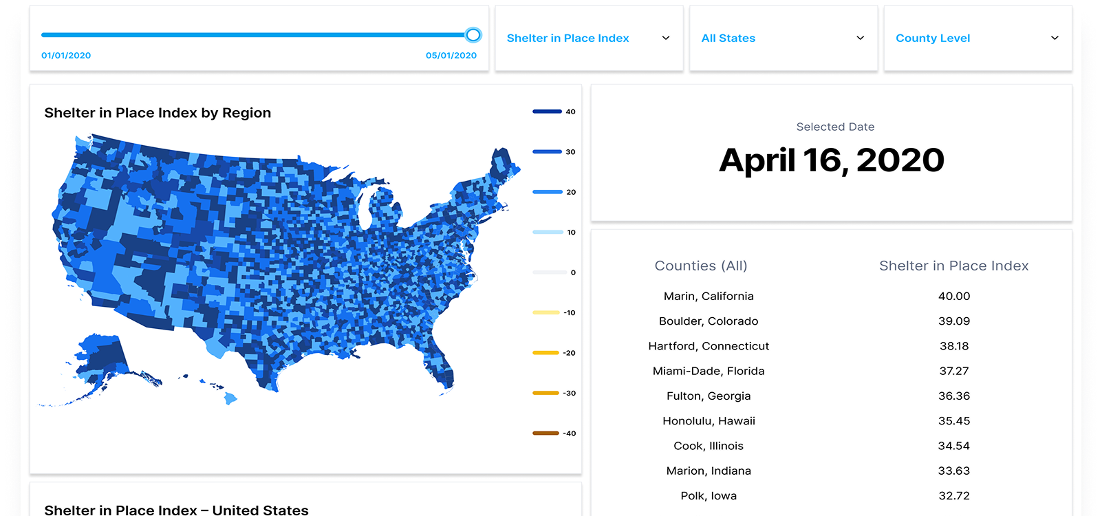
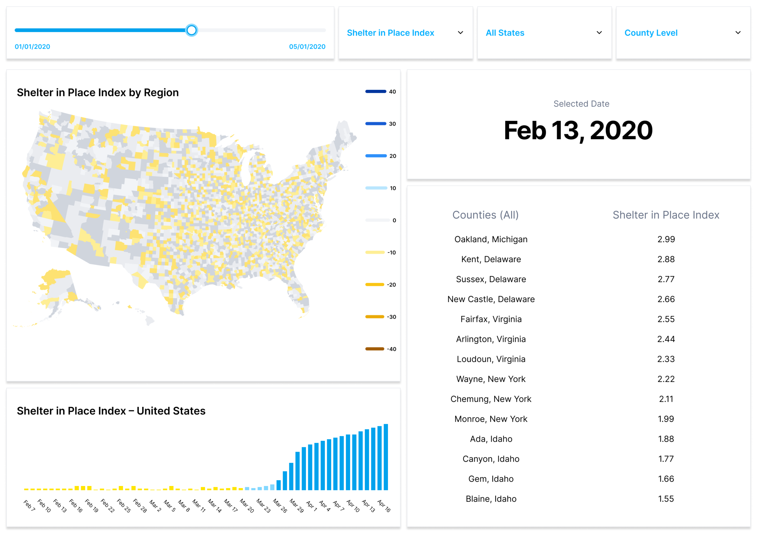
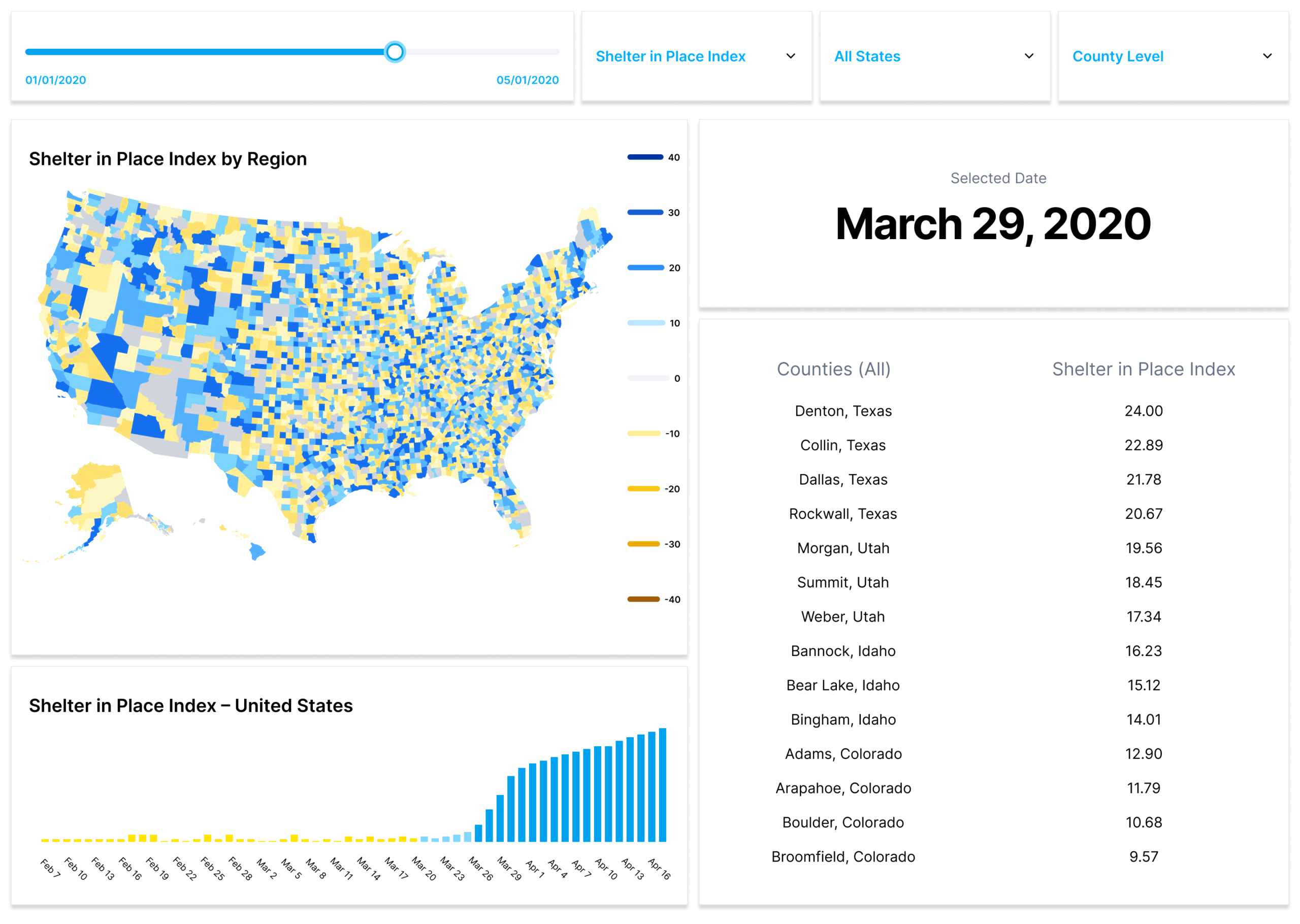
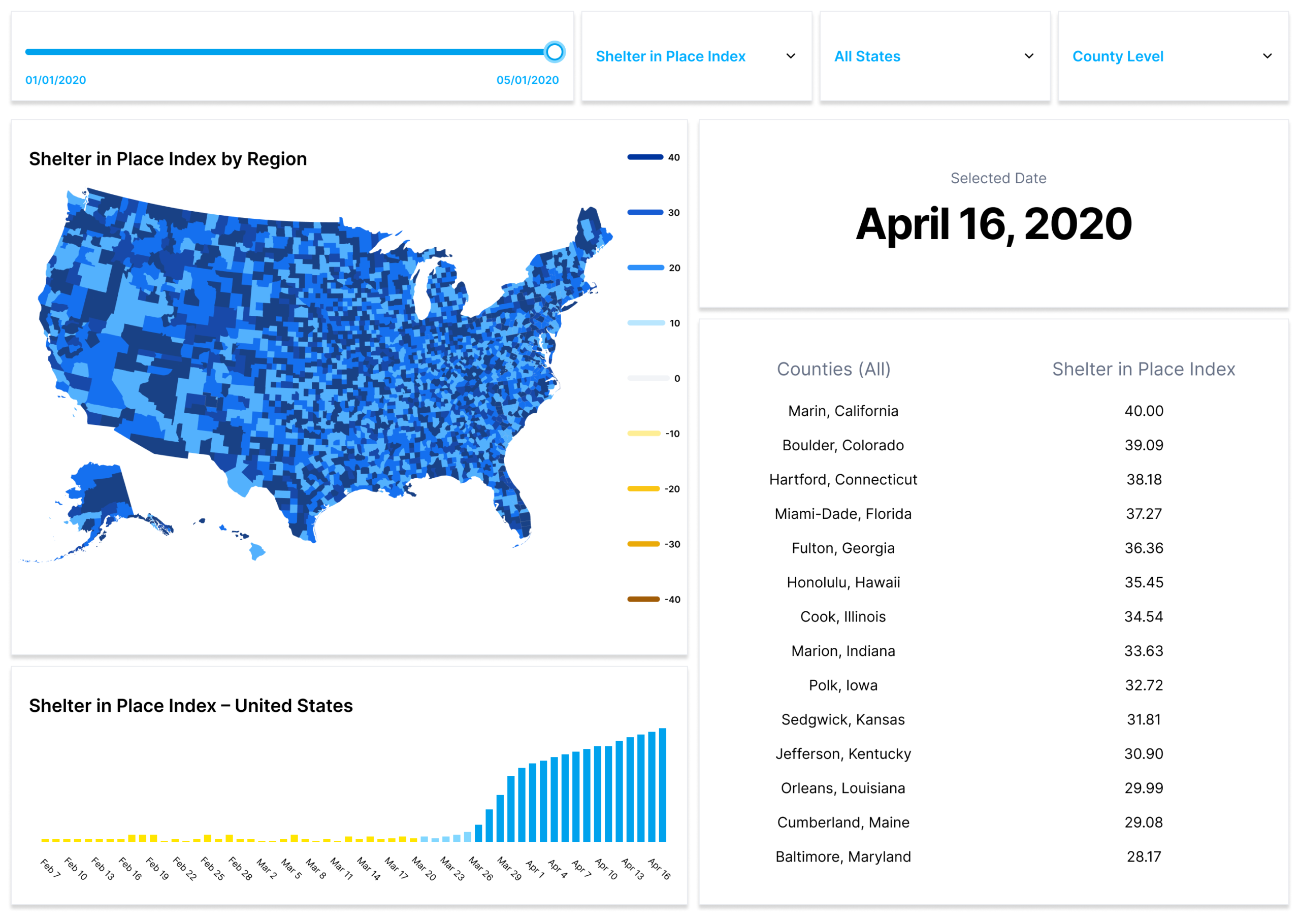
A public, county-level web app that visualizes daily “stayed home all day” behavior and change vs. pre-COVID baseline, updated automatically.
Map-first exploration
Nationwide choropleth down to county level with an interactive time slider to scrub day-by-day changes.
Clear metrics
Quick toggles for “% stayed home all day” and “change vs. baseline.
Daily refresh
Automated ingestion, recomputation, and publish jobs to keep data current.
Performance-first UX
Lightweight UI, responsive layouts, smart caching for traffic spikes.
Open access
No paywall; built for public-good use.
How We Built It
Architecture diagram
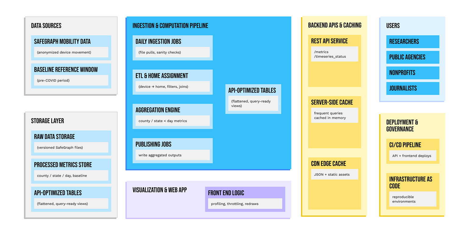
APIs & caching
REST endpoints serve pre-aggregated metrics for fast loads; CDN + cache policies handle surges.
Visualization layer
Interactive map with date slider, metric toggles, legends, and tooltips optimized for quick redraws.
Privacy, security, reliability
Aggregation-only outputs (no individual data), automated monitoring/alerts, CDN-backed hosting.
Data pipeline & computation
Ingest anonymized device-movement data, assign home locations, aggregate by state/day and county/day. Compute both the “completely at home” indicator and delta vs. baseline; publish daily.
Co-development
Working sessions with SafeGraph product/data/policy teams to finalize metric definitions and the baseline window; fast design–engineering loops to balance rigor and clarity.
Results
Signal clarity at a glance
The dashboard made county-level distancing trends legible to non-technical audiences—no GIS or code required.
From raw data to “decision-ready.”
Pre-aggregation + caching cut page loads to “instant-feeling,” enabling real-time policy briefings and media reporting.
Zero-touch distribution
Open web delivery eliminated custom data pulls and manual map-making for recurring stakeholders.
Impact
Targeting high-risk venues
Stanford’s mobility-network model showed a small fraction of POIs drive a large majority of infections; in Chicago, 10% of POIs accounted for ~85% of infections at POIs, guiding occupancy caps as a reopening lever.
Policy effect, quantified
CDC’s early analysis in four metros used SafeGraph’s “completely at home” metric and showed the share leaving home fell from ~80% on Feb 26 to 42–61% by Apr 1, 2020, aligning declines with mitigation policies.
Stay-at-home orders and cases
A research synthesis notes that ≈3 weeks after SIPO adoption, cumulative COVID-19 cases were ~44% lower versus counterfactuals, evidence consistent with large reductions in transmission following policy and mobility shifts.
Independent confirmation
A county-level study (PLOS One) found ~49% lower weekly incident cases after three weeks in jurisdictions with stay-at-home orders, reinforcing the link between distancing and case declines.
Mobility → cases elasticity
Across five U.S. cities, a 10-point drop in mobility corresponded to ~19–20% fewer cases per capita, quantifying how much change in movement affected spread.
Equity insights
Multiple studies using SafeGraph indicators found higher-income areas could stay home more, while disadvantaged groups faced greater exposure risks due to less mobility reduction and more crowded venues—informing more equitable interventions.
Government situational awareness.
FOIA documents show CDC purchased SafeGraph data to monitor curfews, school visits, and pharmacy traffic (e.g., for vaccine tracking), treating these feeds as important inputs to pandemic response.
What We Delivered
- Daily ingestion & aggregation jobs
- Baseline and indicator definitions (documented and encoded)
- REST API for county/state/day metrics with caching
- Public web app (map, slider, metric toggles, tooltips)
- Deployment, monitoring, and runbooks
- Handover + support for ongoing updates
Key Learnings
- Lock the baseline early. A transparent, fixed reference window makes comparisons meaningful and reproducible.
- Ruthless simplicity wins. A map + slider + two metrics beat complex dashboards for speed and comprehension.
- Do the heavy lifting upstream. Pre-compute to keep the UI “instant.”Engineer for burst traffic.
- Public tools need aggressive caching and CDNs.
- Co-create with domain experts. Tight loops with data scientists and policy teams accelerate adoption.