Real-time data visualization platform for early childhood program - 95% reduction in reporting time
Company
La Piñata del Aprendizaje
Business Type
Nonprofit Organization
Team
2 Developers, 1 Designer, 1 Project Manager
Time
6 Months
The Client
La Piñata del Aprendizaje is an early childhood education nonprofit serving caregivers of children ages 0–5.
They combine classes, home practice activities, and Ages & Stages Questionnaires® (ASQ) screenings to track growth across communication, fine motor, gross motor, problem-solving, and social-emotional development.
Solution
La Piñata was rich in data, poor in visibility.
ASQ scores lived in spreadsheets. Caregiver surveys sat in separate tools. Multiple cohorts, age bands, and locations couldn’t be easily compared. Basic questions like “Which cohorts are most at risk?” or “How is this child progressing?” required 20+ hours per month of manual spreadsheet work, copying, cleaning, and rebuilding the same charts.
The real cost wasn’t just time. By the time reports were ready, the data was already outdated. Staff couldn’t intervene quickly when children fell behind. Caregivers received generic feedback instead of visual progress stories. Funders saw last quarter’s snapshot instead of today’s reality.
They needed a visual platform that pulled directly from ASQ, aggregated survey data, stayed fresh automatically, generated trends and analytics, and made program health visible in seconds instead of weeks.
What We Built
A web-based data visualization and management platform with three main lenses, powered by live ASQ data updated daily via API call
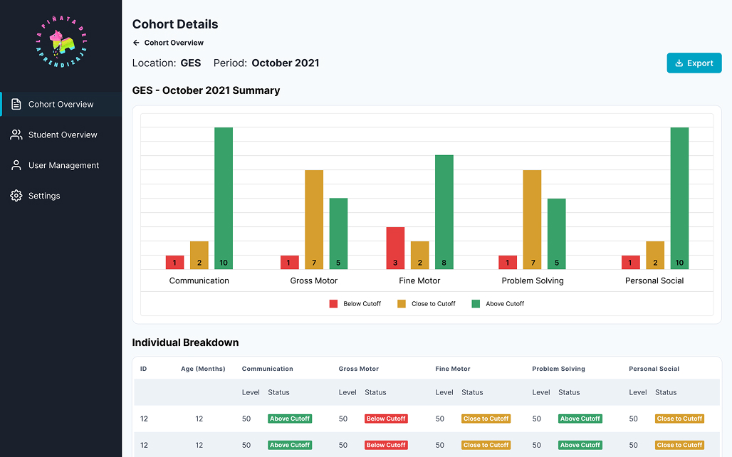
Cohort Dashboards
Cohort overview with tiles grouped by age/month.
Color-coded counts of children Above / Close-To / Below cutoff.
Cohort detail view with:
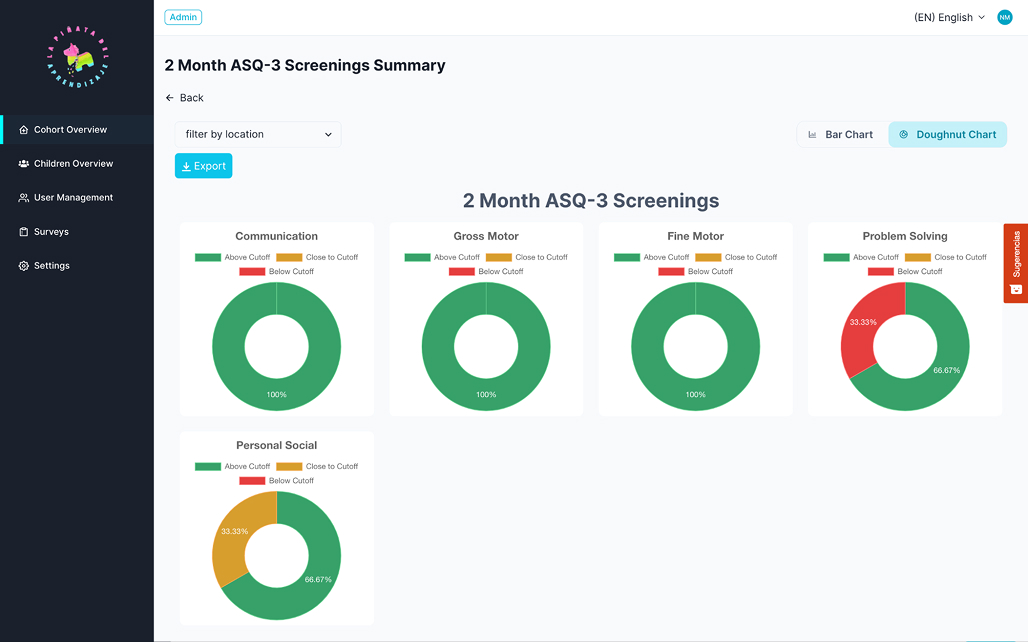
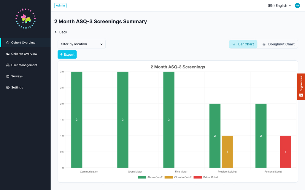
Bar charts by domain (communication, fine motor, etc.).
Doughnut charts showing distribution across cutoff categories.
All metrics updated daily via ASQ API sync.
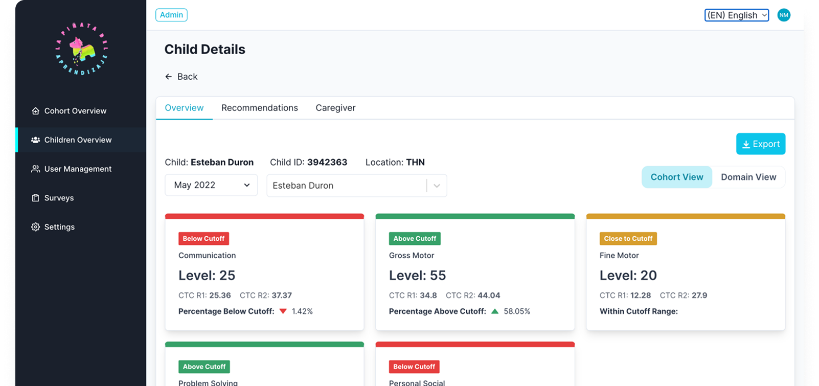
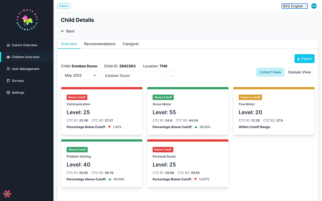
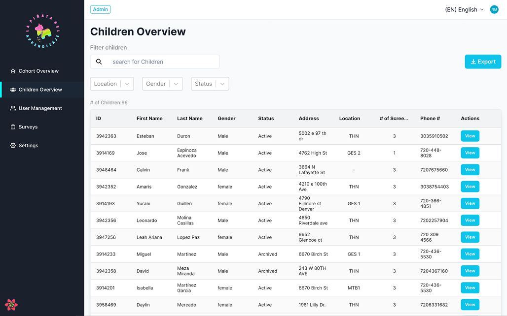
Child-Level Dashboards
Children overview table with search and key attributes.
Child detail page with:
Domain view: visual breakdown of scores and cutoffs.
Cohort view: where the child sits within their group.
History table: timeline of screenings and recommendations.
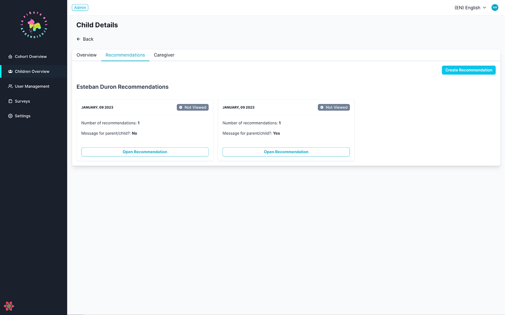
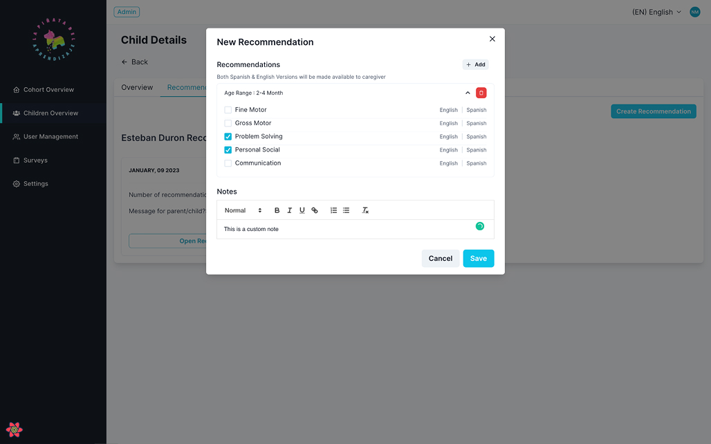
Recommendations section linked to age/month ranges and notes.
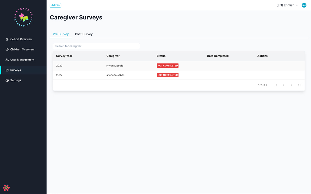
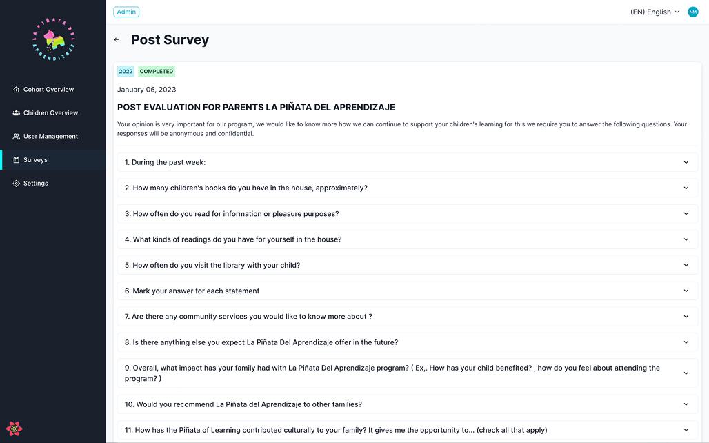
Survey & Role-Based Views
Survey list with status (pre/post, completed).
Survey detail views for program evaluation.
Role-based access for Admin, Program Admin, and Caregivers to keep views focused and secure.
How We Built It
ASQ API Integration
Connected directly to the ASQ API to pull screening results.
Set up a daily cron job to ingest new/updated screenings and refresh dashboards automatically.
Visualization-first UX
Started from key questions (“Which cohorts are at risk?” “What’s this child’s story right now?”)..
Standardized on a small, consistent set of chart types and colors for cutoff categories
Discovery & Modeling
Defined core entities (cohort, child, caregiver, screening, recommendation, survey, user) around real program workflows.
Application & data layer
Single source of truth for cohorts, children, screenings, recommendations, and surveys.
Training & documentation
Admin Manual + live training focused on interpreting the dashboards and trusting the daily data refresh.
Results & Impact
95% reduction in reporting time
What took 20+ hours of manual work each month now happens automatically;a 95% reduction in reporting time. Staff log in to fresh data every morning.
From fragments to a single source of truth
Visual cohort and child dashboards replace scattered files and ad hoc reports. No more version-control chaos or lost spreadsheets.
Faster interventions
Program leads can immediately see where Below / Close-To-Cutoff children cluster and redirect coaching, staffing, or curriculum focus while issues are still emerging, rather than weeks later.
Increased caregiver engagement conversations
Child-level visuals give staff a shared, concrete way to discuss progress and focus areas with caregivers. Parents respond better to visual progress stories than raw score tables.
Stronger funder relationships
Real-time charts and structured exports make it easier to demonstrate impact with current data instead of stale quarterly snapshots. Grant renewals now include live dashboard access.
Key Deliverables
Data model + schema optimized for ASQ and survey visualization
ASQ API integration with daily automated refresh
Web app with cohort dashboards, child profiles, recommendations module, survey views, and role-based access
Admin manual + staff training
Ongoing technical support and feature enhancements
Exportable Reports for various views and filters.
Key Learnings
Live integrations change organizational culture
Direct ASQ API connection transformed reporting from a quarterly scramble into everyday visibility, shifting the team’s mindset from reactive to proactive.
Simple beats sophisticated
A small set of clear, consistent visuals outperforms complex analytics for busy program teams who need to act quickly.
Automation enables new workflows
The daily cron refresh didn't just save time; it also unlocked faster interventions, better caregiver conversations, and more credible funder reporting. Efficiency gains compound into impact gains.