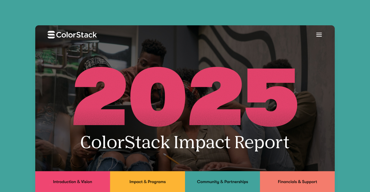
ColorStack is a nonprofit organization committed to increasing the number of Black and Latinx computer science graduates by fostering community, academic support, and career opportunities.
For the 2025 Impact Report, we worked with ColorStack to redesign how their annual story of impact was presented. The goal was to transform extensive written content and data into a visually engaging, easy-to-navigate digital experience that celebrates their mission, highlights key metrics, and keeps the human stories at the heart of their work.
Understanding the Problem
ColorStack provided a wealth of content, from program outcomes and student stories to growth metrics and partnership highlights. The challenge was connecting it all in a way that was cohesive, skimmable, and emotionally resonant.
We needed to show the depth of their impact without overwhelming the reader. The design had to balance storytelling with structure, allowing readers to move fluidly between data and narrative while maintaining a strong sense of warmth and authenticity.
Approach
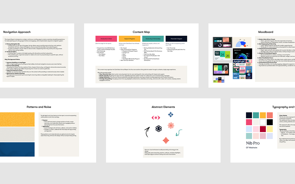
Strategy and Structure
We began with strategy. The goal was to organize the report’s content into a clear and intuitive structure. This phase focused on:
Grouping content into logical categories such as Impact & Programs, Community and Financials & Support.
Defining navigation for a smooth, high-volume content experience.
Mood boarding to explore tone, typography, and color.
Deciding whether to use texture, subtle patterns, or abstract connectors to add visual depth.
Wireframing and Information Design
Next, we created low-fidelity wireframes to test layout flow, chart placement, and information hierarchy. This stage focused on pacing and readability, ensuring each section guided the reader naturally through the report while maintaining context and meaning behind every data point.
High-Fidelity Design
In the final stage, we combined structure and visual storytelling to create the full high-fidelity experience. Photography, illustration, and clean typography came together to reflect ColorStack’s brand and personality. Data visualization elements were designed to be concise, consistent, and easy to interpret at a glance.
Key design decisions
Anchored Section Navigation
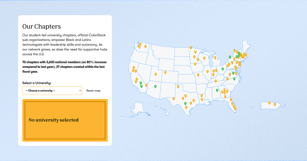
To help readers explore a long, content-rich report, we introduced anchored navigation tabs that stay visible as users scroll. This made it easy to jump between sections like Community, Career, and Curriculum without losing context.
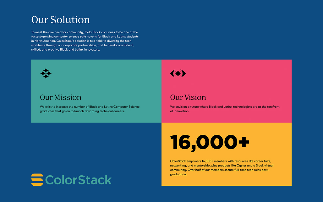
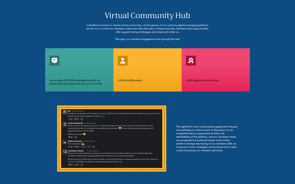
Progressive Data Reveal
Instead of overwhelming users with large data blocks, we structured charts and stats to unfold progressively down the page. This pacing improved comprehension and helped maintain engagement throughout long-form reading.
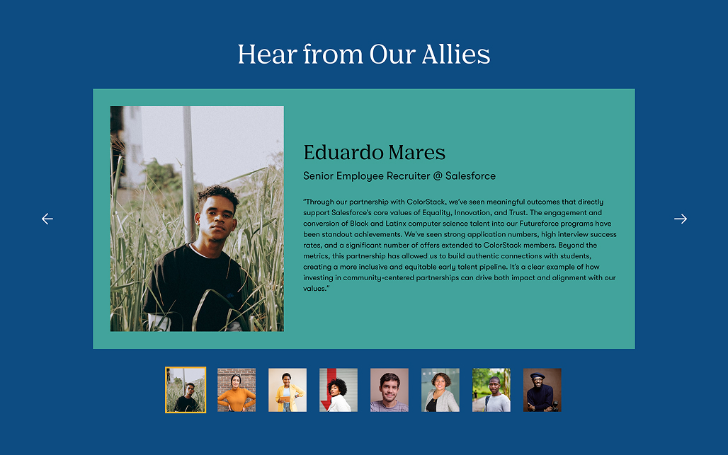
Integrated Callout System
We developed a unified style for callouts, quotes, stat highlights, and key takeaways, so readers could intuitively recognize important information across all pages.
Collaboration Process
Discovery and Alignment
Strategic design documents were shared with the ColorStack team for review, both asynchronously and during live sessions. This process ensured that content priorities, hierarchy, and tone were aligned before we moved into design execution.
Handoff
We delivered a comprehensive Figma system with annotated components, interaction specs, and responsive guidelines. A structured handoff session with the development team clarified implementation details and surfaced questions early, ensuring minimal revisions and a shipped product that matched design intent.
Key Outcomes
The 2025 Impact Report presents ColorStack’s data and achievements in a concise, organized, and visually engaging way.
Readers can quickly absorb key highlights while still exploring deeper stories and details. The report now clearly communicates the scale of ColorStack’s impact while keeping the focus on people, progress, and purpose.
Tools
FigJam – Strategy and narrative structure
Figma – Layout, visualization, and final design
Deliverables
Complete 2025 Impact Report design
Interactive content flow and visual hierarchy system
Annotated Figma file for developer implementation
Key Takeaway
The ColorStack 2025 Impact Report demonstrates that the most powerful design decisions aren’t visual, they’re structural. Instead of opening with charts and metrics, we reframed the narrative around people and stories, allowing the data to provide context rather than dominate the conversation. This subtle shift transformed how readers engaged with the report: numbers that once felt abstract now carried human weight and urgency. By restructuring the flow from data-first to story-first, we built a more intuitive and emotionally resonant experience that deepened understanding and inspired action. For mission-driven organizations, this approach underscores a key insight: structure shapes empathy, and empathy moves people to act.